During my 6 years at Net Pay Advance, I worked on a variety of projects including customer portal revamps, a full redesign of the new customer application, and the early development of a brand-wide design system.
One project I’m particularly proud of is the homepage redesign.
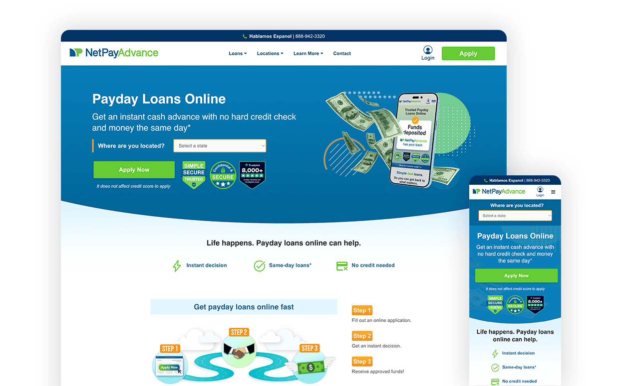
Project Overview
The primary goal of the homepage was to drive loan applications. A major pain point was that many users would start an application without realizing we didn’t service their state, only to be denied. To reduce this frustration, I introduced a “Select Your State” dropdown. If a user selected an unsupported state, they were redirected to a page that clearly communicated that loans were not available in their area. This helped reduce drop-offs and guided users more efficiently.


Design Process
Discovery: We identified that most users were not scrolling past the top fold of the homepage and conversions were low. We also recognized a need for more impactful content sections.
Research: I conducted a competitive analysis to see how similar companies structured their homepages. In addition to looking at industry trends, we focused on what our customers needed most. What actions were they trying to take? What information were they looking for?
Wireframing: I explored different layout ideas and led review sessions to refine the organization and flow of content.
Mockups: Once the page structure was agreed upon, I created low-fidelity mockups, followed by high-fidelity designs that were used for final approval.
Development: After design approval, I developed the new homepage layout.
Results
After launch, we implemented Mouseflow to monitor user behavior. Heatmaps showed higher engagement with critical sections and confirmed that the updated design helped improve the overall user experience.
Next Steps/Ongoing Work
Following the homepage redesign, we realized how effective the new components and layout structure were. This led to the decision to create a formal design system. I’m currently leading the effort to build this system in Figma alongside the team, with the goal of maintaining visual consistency, improving efficiency, and supporting future scalability across the site.
Tools
Adobe XD: Used for wireframing, prototyping, and developer handoff (to myself).
WordPress + Gutenberg editor: Used as the content management system and page builder.
Languages Used
HTML
CSS
JavaScript